

Accessibility in Power BI
When you are designing Power BI reports, are you incorporating accessibility and inclusion?
As the world continues to rely more heavily on data, data visualization software, and making data accessible to all, we need to do a better job being inclusive with our #dataviz design.
For the past 6 months, I've been trying to do a better job designing reports with accessibility in mind but still have a ways to go… The last month has provided some major leaps forward in documentation/tools to help improve Power BI report design with accessibility and inclusion in mind! I’m really excited for the following documentation and tools to help us all create more inclusive Power BI reports (and Tableau, etc.)
Here’s my top two design 'tools' to help improve accessibility:
Microsoft’s Accessibility in Power BI docs. ICYMI: about a month ago Microsoft released more robust documentation to help improve Power BI report creation with accessibility in mind!! https://docs.microsoft.com/en-us/power-bi/desktop-accessibility-overview
Highlights include:
Vision accessibility
Keyboard navigation and screen-reader compatibility (alt text and tab order)
Links to a number of tools to help check your reports for inclusion
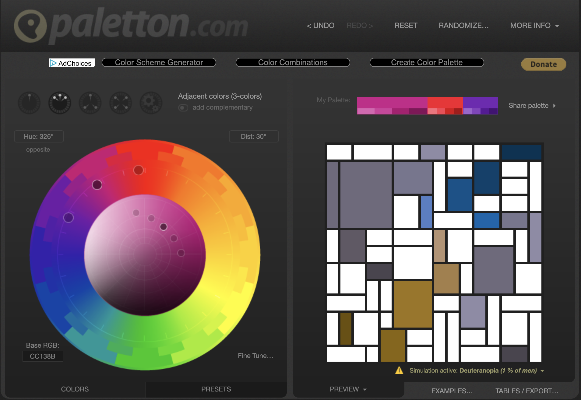
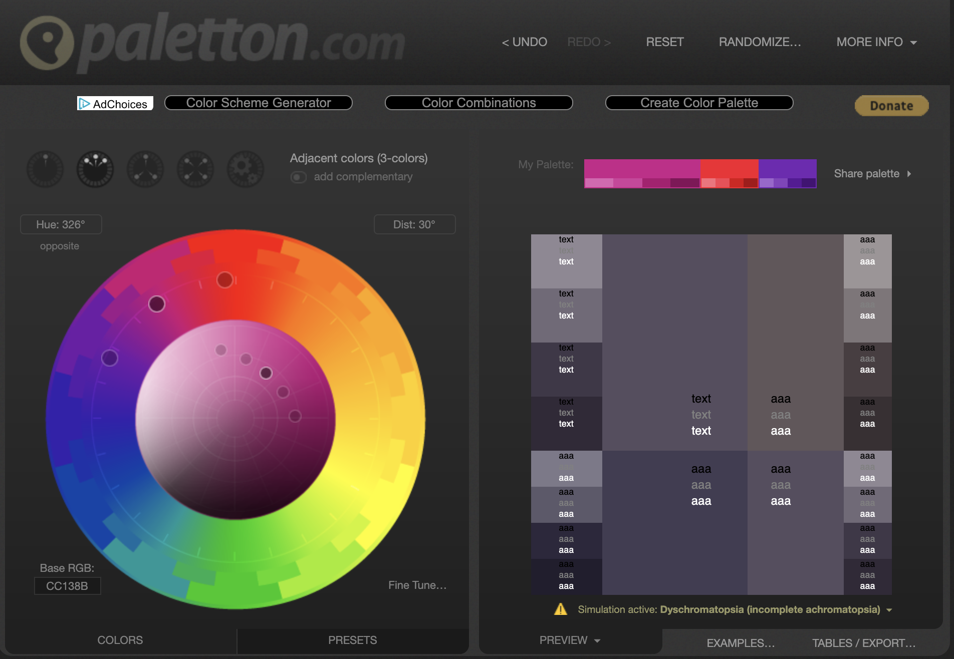
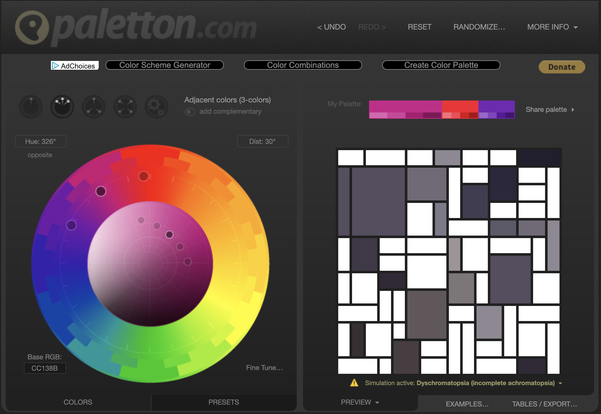
I create a number of custom design elements when I’m designing reports for clients. Oftentimes, clients will only give me their logo and one or two colors to create a full Power BI theme. My favorite UX/UI person, Adam Krueger, shared Paletton.com with me. This is my main tool to decide on adjacent and complementary colors to include when generating a theme json file thanks to powerbi.tips. Today, I noticed that Paletton included a ‘vision simulation’ tool to visualize how people with vision accessibility roadblocks see the colors I’ve decide to use in my reports! Under the Preview tab, my two favorite ways to see the colors is with the Mondrianish mosaic and Alternative with text. I can’t rave enough about my love of this FREE tool!!
A few images from Paletton.com using the vision simulation feature. You can also view a short video on YouTube or LinkedIn.

Further reading/links:
If you’d like to work on becoming a better designer with regards to inclusion and accessibility, or just better understand people who might be different from you… here are a few of the many resources out there to help! And don’t forget, data is powerful but language is even more so. Please leave a comment if you have some good recommendations to share that we could all benefit from learning about to improve #a11y in the data community!
The A11y Project - this is a great resource, along with #a11y on Twitter.
The power of language - Respectful Disability Language
If you are interested in working with me and the awesome data team at Practice Engine, comment below or email me at kcoriell@practice-engine.com.
All opinions and recommendations are my own, and I’ve not deep-dived into the above links but they have all been useful to me in 2019.